Well I finally put this together over spring break last week. I have a friend who owns a sign shop, so I trailered the boat to his lot and we went to work.
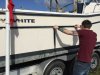
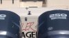
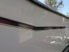
First, the stripe had been beat up by crab pots and some hard dock approaches. Since this was strictly a cosmetic issue I was advised the fastest (READ: cheapest) way to correct was to simply put new vinyl striping over the old. You can only tell it was done by getting reallllyyyyy close and squinting. The alternative is heat gun removal, and the gray stripe was sun bleached and chipped and would have been a bear to remove. New result is a slightly larger Midnight Blue upper stripe to fully cover the original, and we switched the gray stripe to a slightly wider gold. Again, these new vinyl stripes cover the beaten up older ones and are slightly larger to cover completely. I'm happy with the result.
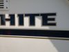
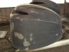
Next was the faded Grady-White lettering on port and starboard. He feels this may be a limited production "gel silkscreen" (no clue) and that is why the blue has bled out, and probably why the only replacements you can find are the newer silver logo. THESE ARE ALSO A NON-STOCK FONT, slightly squatter and longer than anything you can download from Grady. So the problem is if you do decide to replace the faded logo entirely, the new one will not fit precisely over the "ghosting" sun protected area and you'll have a "ghost image" of the prior stickers. We decided to hand paint the blue letters back on, as the gold was fine. I think it turned out good, although the blue he had didn't match 100% the striping or original blue.... my goal was just to make it not look so beat up.
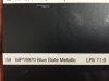
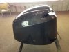
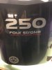
Third, my sun bleached cowling stickers. As we tried to remove the stickers the underlying paint chipped, and it became apparent the new stickers wouldn't cover the chips adequately. Plus there were some other prior piling scrapes and cracks and dings. After reading about the troubles of matching the original Yamaha paint color either in a rattle can or touch up paint, I decided the only way to go was sand them down and repaint them entirely.
We feel the original paint must be a "pearl" with several layers of clear coat to add depth. Pearl is super spendy and technique sensitive. I was offered a less expensive and easier sign paint Matthews flake. Since my goal was to simply update the general "first glance" uniformity, I was happy to accept the slight color discrepancy which I knew would most likely only be noticible on the trailer. The lower unit paint isn't even flake anyway...
There were two very close paints and I chose the darker of the two, figuring lighter would only make it look older and faded. After sanding and primer, this is three coats of base and about 6 clear coats. I'm happy with how it looks. In these pictures there is still some road grime on the lower units which I will clean up and make look more uniform.
NOTE: I only ordered one set of replacement YAMAHA decals, the other set is en route as I type.
I'll get you the paint color, manufacturer, and code as soon as I can.
(480x640).jpg[/attachment](480x640).jpg[/attachment]
First, the stripe had been beat up by crab pots and some hard dock approaches. Since this was strictly a cosmetic issue I was advised the fastest (READ: cheapest) way to correct was to simply put new vinyl striping over the old. You can only tell it was done by getting reallllyyyyy close and squinting. The alternative is heat gun removal, and the gray stripe was sun bleached and chipped and would have been a bear to remove. New result is a slightly larger Midnight Blue upper stripe to fully cover the original, and we switched the gray stripe to a slightly wider gold. Again, these new vinyl stripes cover the beaten up older ones and are slightly larger to cover completely. I'm happy with the result.
Next was the faded Grady-White lettering on port and starboard. He feels this may be a limited production "gel silkscreen" (no clue) and that is why the blue has bled out, and probably why the only replacements you can find are the newer silver logo. THESE ARE ALSO A NON-STOCK FONT, slightly squatter and longer than anything you can download from Grady. So the problem is if you do decide to replace the faded logo entirely, the new one will not fit precisely over the "ghosting" sun protected area and you'll have a "ghost image" of the prior stickers. We decided to hand paint the blue letters back on, as the gold was fine. I think it turned out good, although the blue he had didn't match 100% the striping or original blue.... my goal was just to make it not look so beat up.
Third, my sun bleached cowling stickers. As we tried to remove the stickers the underlying paint chipped, and it became apparent the new stickers wouldn't cover the chips adequately. Plus there were some other prior piling scrapes and cracks and dings. After reading about the troubles of matching the original Yamaha paint color either in a rattle can or touch up paint, I decided the only way to go was sand them down and repaint them entirely.
We feel the original paint must be a "pearl" with several layers of clear coat to add depth. Pearl is super spendy and technique sensitive. I was offered a less expensive and easier sign paint Matthews flake. Since my goal was to simply update the general "first glance" uniformity, I was happy to accept the slight color discrepancy which I knew would most likely only be noticible on the trailer. The lower unit paint isn't even flake anyway...
There were two very close paints and I chose the darker of the two, figuring lighter would only make it look older and faded. After sanding and primer, this is three coats of base and about 6 clear coats. I'm happy with how it looks. In these pictures there is still some road grime on the lower units which I will clean up and make look more uniform.
NOTE: I only ordered one set of replacement YAMAHA decals, the other set is en route as I type.
I'll get you the paint color, manufacturer, and code as soon as I can.
(480x640).jpg[/attachment](480x640).jpg[/attachment]
Attachments
-
 051 (640x422).jpg69.5 KB · Views: 3,385
 -
 068 (640x480).jpg43 KB · Views: 3,385
 -
 052 (640x480).jpg75.7 KB · Views: 3,385
 -
 OLD LOGOS (640x361).jpg41.4 KB · Views: 3,385
 -
 Cowling paint (640x480).jpg54.8 KB · Views: 3,384
 -
 047 (640x480).jpg73.3 KB · Views: 3,385
 -
 048 (640x480).jpg62.7 KB · Views: 3,385
 -
 071 (640x480).jpg59.9 KB · Views: 3,385
 -
 091 (480x640).jpg50.7 KB · Views: 3,384
 -
 097 (480x640).jpg69.5 KB · Views: 3,384
 -
 102 (640x480).jpg59.1 KB · Views: 3,385
 -
 STripe (640x480).jpg49.8 KB · Views: 3,385